Understanding Cover Letter Formatting
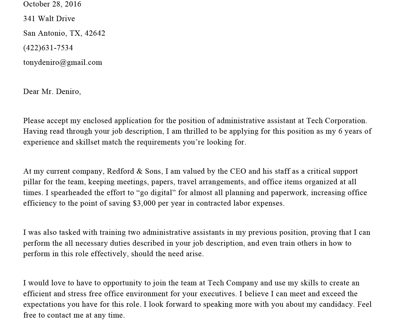
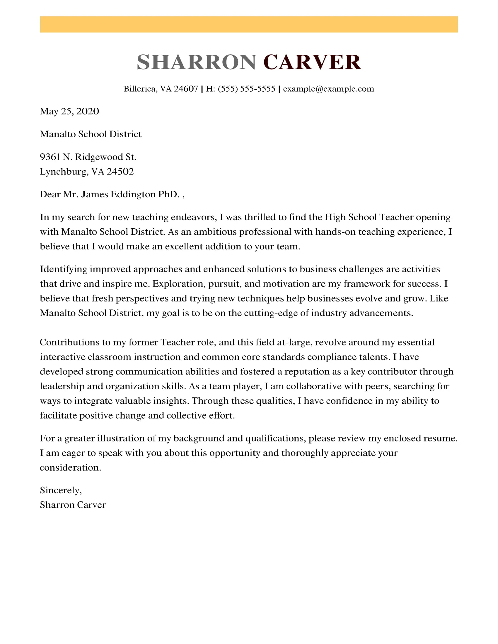
A well-formatted cover letter is crucial for making a positive first impression on potential employers. Your cover letter is often the first document a hiring manager will see, making it your initial opportunity to showcase your professionalism and attention to detail. Proper formatting extends beyond mere aesthetics; it significantly impacts readability and the overall impact of your application. Consistent and clean formatting demonstrates respect for the reader’s time and highlights the key information you want them to notice. Poor formatting, conversely, can lead to a negative perception, making you appear careless or unprofessional. Therefore, understanding the fundamentals of cover letter formatting, including font size, margins, and overall layout, is essential for job seekers aiming to create a compelling and effective application.
Why Font Size and Margins Matter
Font size and margins play a critical role in the readability and visual appeal of your cover letter. The right font size ensures that your content is easy to read, preventing eye strain and making it easier for the hiring manager to digest the information. Margins, on the other hand, create white space around the text, which helps in organizing the content and preventing it from appearing cluttered. Well-chosen margins also contribute to the overall aesthetic balance of your cover letter, making it look more professional and polished. These elements work together to guide the reader’s eye through your document, highlighting the important aspects of your qualifications and experience. Ignoring these details can inadvertently make your cover letter difficult to read, leading to a negative impression.
Font Size Recommendations for Cover Letters
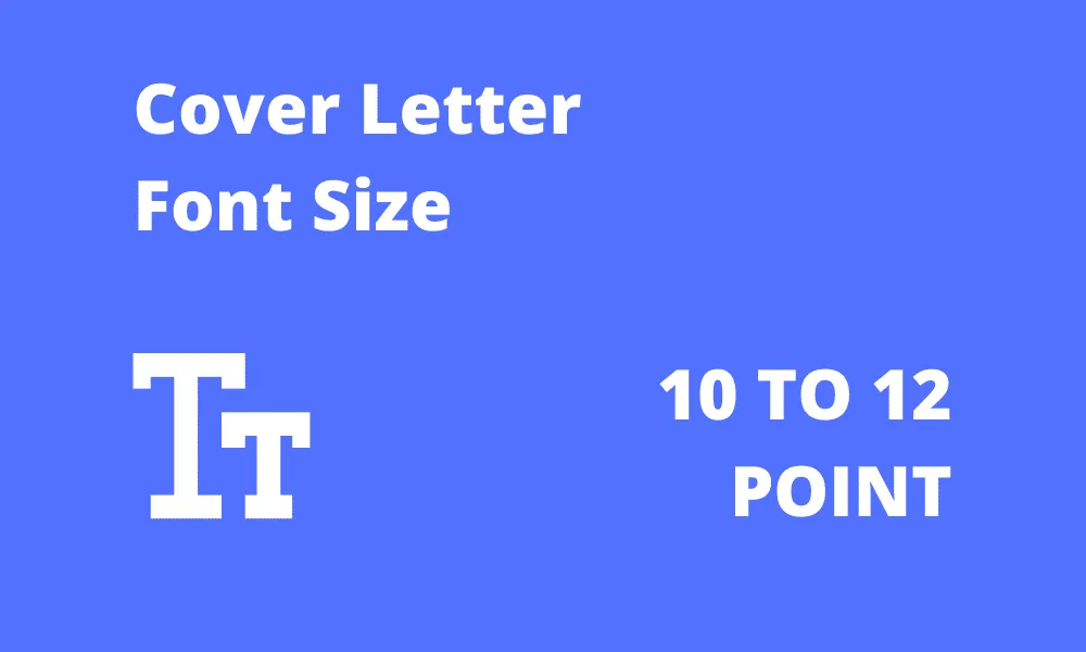
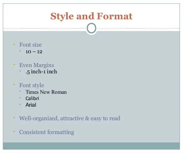
For optimal readability, the recommended font size for a cover letter typically ranges between 10 and 12 points. This range provides a balance between fitting all necessary information on the page and ensuring that the text is easy to read. A 10-point font is usually suitable for most standard fonts, like Times New Roman or Arial, maintaining a clean and organized appearance. However, if the font you choose appears smaller, you might want to increase the size slightly to 11 or 12 points to ensure clarity. It’s important to test how the text looks in print to make sure it doesn’t appear too cramped or too spread out. Always prioritize the readability of your document; the goal is to make it easy for the hiring manager to quickly understand your qualifications.
Optimal Font Sizes for Different Sections
While the body of your cover letter should maintain a font size between 10 and 12 points, you might consider slightly different sizes for specific sections to improve readability. Headings and your name at the top of the cover letter can be slightly larger, perhaps 14 to 16 points, to draw the reader’s attention. This distinction helps to visually organize the different sections of your cover letter and make it easier to navigate. For your contact information, you could use a font size of 10 to 11 points to keep it compact. Consistent formatting within each section enhances the professional look of your letter. Remember, the goal is to ensure that the most important information stands out without overwhelming the reader.
Choosing the Right Font for Readability
Selecting a font that is both professional and easy to read is essential. Serif fonts, like Times New Roman, Georgia, and Garamond, are generally recommended for body text because they have small strokes (serifs) that guide the eye across the page. These fonts can provide good readability, particularly in print. However, sans-serif fonts, such as Arial, Calibri, and Helvetica, are also suitable and often preferred for digital documents as they appear clean and modern. The most important consideration is to choose a font that appears clear and legible at the selected font size. Avoid using overly decorative or unusual fonts, as these can distract the reader and detract from your message. Stick to classic, widely-used fonts to ensure your cover letter looks professional and accessible.
Font Style Recommendations
When it comes to font styles, you should mainly use regular or roman styles for the main body of your cover letter. It’s generally a good practice to use bold for headings or your name at the top to make them stand out. Reserve italics and underlining for emphasis only, and use them sparingly. Excessive use of bold, italics, or underlining can make your cover letter look cluttered and unprofessional. Consistency in your formatting is key; make sure all headings are formatted the same way and all body text has the same font and size. Maintaining a consistent style across the document also reinforces a sense of professionalism and shows attention to detail. Using a professional and standard style will help your cover letter look cleaner and more professional.
Cover Letter Margins: Best Practices
Margins play a crucial role in the visual organization and readability of your cover letter. Properly set margins create a balanced and uncluttered layout, making it easier for the hiring manager to focus on your content. Appropriate margins provide necessary white space, which helps to prevent the text from appearing cramped or overwhelming. Effective use of margins allows you to visually separate different sections of your cover letter and guides the reader’s eye through the document in a logical manner. Consistent margins throughout the document also lend a professional and polished appearance, contributing significantly to a positive first impression. The correct settings are essential to ensure the cover letter looks balanced and easy to read.
Standard Margin Settings
The standard margin settings for cover letters are typically one inch on all sides (top, bottom, left, and right). This setting is a common and widely accepted practice. It ensures that your text is neither too close to the edges of the page nor too far in, providing a balanced appearance. A one-inch margin setting provides adequate white space around your text, enhancing readability and allowing for any comments or notes a recruiter might want to make. You can slightly adjust margins based on the specific font and the amount of text you have, but sticking close to the standard one-inch setting will generally give the best result. It is a safe and professional setting to start with.
Adapting Margins for Content
While the standard one-inch margin is generally recommended, you can adjust the margins slightly depending on the length of your cover letter. If your cover letter is very short, you might consider slightly increasing the margins to create a more balanced look. Conversely, if your cover letter is quite long, you might reduce the margins to increase space. However, avoid excessively narrow margins as they can make the document appear crowded and difficult to read. The adjustments should be minimal, with readability as your primary concern. Always aim for a balanced appearance, ensuring that there is sufficient white space around the text to avoid a cluttered look. The goal is to keep it easily scannable for the reader.
Ensuring Your Cover Letter is ATS-Friendly
Many companies use Applicant Tracking Systems (ATS) to manage the application process. These systems can scan your cover letter and resume for keywords and other information. When formatting your cover letter, it’s important to consider ATS compatibility. Stick to standard fonts, such as Arial or Times New Roman, and avoid complex formatting, such as tables, text boxes, or images within the body of the text. Use clear headings and ensure that your content is well-organized with adequate white space to make sure that the ATS can accurately extract the information. Double-check that your cover letter and resume are free of any formatting errors that might confuse an ATS. Keeping your cover letter ATS-friendly increases your chances of having your application reviewed by a human.
Common Mistakes to Avoid
Several common formatting mistakes can negatively impact your cover letter. These mistakes can damage your application and create a negative impression on the hiring manager. Some mistakes to avoid include using font sizes that are too small or too large, creating illegible documents. Ensure that the font is easy to read. Another common mistake is using inconsistent formatting, which can make your cover letter look unprofessional. Use the same font, size, and style throughout the document, to ensure consistency. Finally, avoid cramped margins and excessive white space, and ensure a balanced and easy-to-read layout. A clear and professional format will help you make the best impression.
Font Size Too Small
Using a font size that is too small can make your cover letter difficult to read, which can frustrate the hiring manager. Small fonts are not only hard on the eyes but also convey a lack of consideration for the reader. Hiring managers often review many applications, so they have little time to strain to read a poorly formatted cover letter. Ensure that your font size is large enough to be easily readable from a comfortable distance. If in doubt, it’s better to choose a slightly larger font size to ensure clarity and legibility. Prioritizing readability is paramount to making a positive impression.
Margins Too Narrow
Narrow margins can make your cover letter appear cramped and unprofessional. Text that runs too close to the edges of the page can be difficult to read, and the document can look cluttered. Adequate margins provide necessary white space, making your cover letter more visually appealing and easier to scan. When margins are too narrow, the text seems crowded, and it can be challenging to separate different sections. Ensure that your margins provide enough space to create a balanced layout and enhance the overall appearance of the cover letter. Proper margins will make the cover letter appear more professional and easier on the eye.
Formatting Tips for Different Software
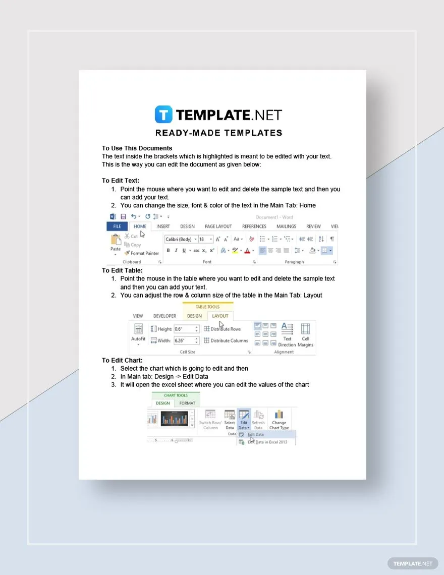
Different word processing software, such as Microsoft Word and Google Docs, offer various formatting options. When preparing your cover letter, familiarize yourself with the formatting tools available in your chosen software. In Microsoft Word, you can adjust font size, font style, and margins easily through the ‘Font’ and ‘Layout’ tabs. Google Docs offers similar functionality in the ‘Format’ menu, with options to change text styles and adjust margins. Regardless of the software, always preview your cover letter before submitting it, and check how it will look when printed. Make sure all formatting is consistent and professional-looking. The goal is to create a polished and easy-to-read document that impresses the hiring manager.
