Why Cover Letter Fonts Matter
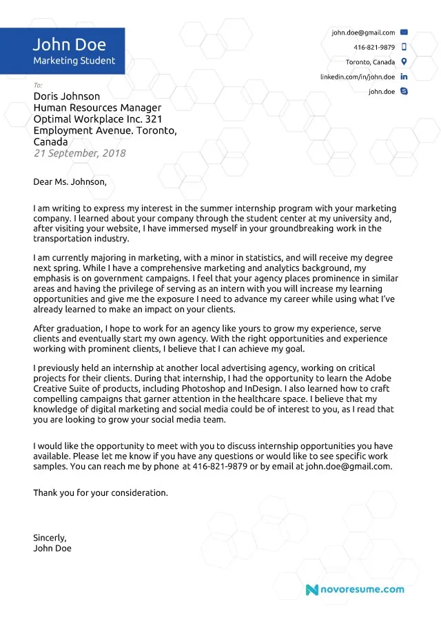
Your cover letter is your first impression, and every detail counts, including the font you choose. It’s not just about aesthetics; the right font significantly impacts readability and professionalism. A well-chosen font makes your cover letter easy to read, allowing the hiring manager to focus on your qualifications and experiences. Conversely, a poorly chosen font can make your letter appear cluttered, unprofessional, and even difficult to read, potentially leading to your application being overlooked. Therefore, selecting the right font is a crucial step in crafting a compelling cover letter that grabs attention and secures an interview. The font you choose can also subtly communicate your personality, attention to detail, and understanding of professional norms.
Choosing the Right Cover Letter Font
When selecting a cover letter font, consider readability, professionalism, and the overall impression you want to make. Opt for fonts that are clear, clean, and easy on the eyes. Avoid overly decorative or unusual fonts, as they can distract the reader and detract from your message. The goal is to ensure your cover letter is easily accessible, allowing the hiring manager to quickly grasp your key qualifications and suitability for the role. The best fonts are typically those that are widely recognized and considered standard for professional documents, such as Times New Roman, Arial, or Helvetica. These fonts have been around for years and are designed to optimize readability, ensuring your application makes a positive impact.
Serif vs Sans-Serif Fonts
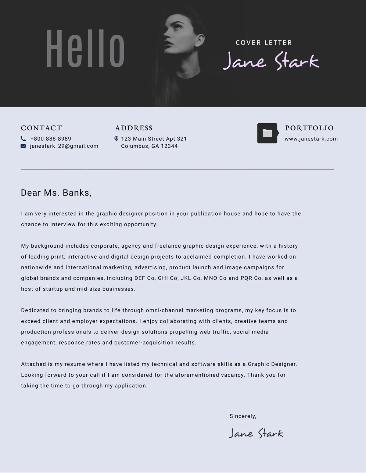
Fonts are broadly categorized into serif and sans-serif types, each with distinct characteristics that influence readability and visual appeal. Serif fonts have small decorative strokes, called serifs, at the end of each letter. These fonts, like Times New Roman and Georgia, can convey a sense of tradition, authority, and formality. They are often considered good choices for print because the serifs guide the eye across the page, enhancing readability in longer blocks of text. Sans-serif fonts, such as Arial and Helvetica, lack these decorative strokes. They have a cleaner, more modern look, offering a streamlined appearance. They are particularly suitable for digital display because they are very clear on screens. When choosing between the two, consider the job industry and the overall tone of your cover letter.
Best Serif Fonts for Cover Letters
Serif fonts can add a touch of sophistication and professionalism to your cover letter. They are excellent choices if you are applying for roles in more traditional industries or where a formal tone is appreciated. Well-chosen serif fonts are not only readable but also give your cover letter a classic, polished appearance. Common examples of serif fonts are Times New Roman and Georgia, and both are widely available and have excellent readability. They are easily accessible and offer a solid foundation for a professional cover letter, ensuring that your application looks polished and well-considered.
Times New Roman
Times New Roman is a classic serif font, known for its excellent readability and professional appearance. This font is a standard choice across various industries, making it a universally accepted option for cover letters. Its clear letterforms and balanced proportions ensure easy reading, and it projects an image of reliability and tradition. If you’re unsure which font to choose, Times New Roman is a safe and reliable choice, as it complements any cover letter content and formatting.
Georgia
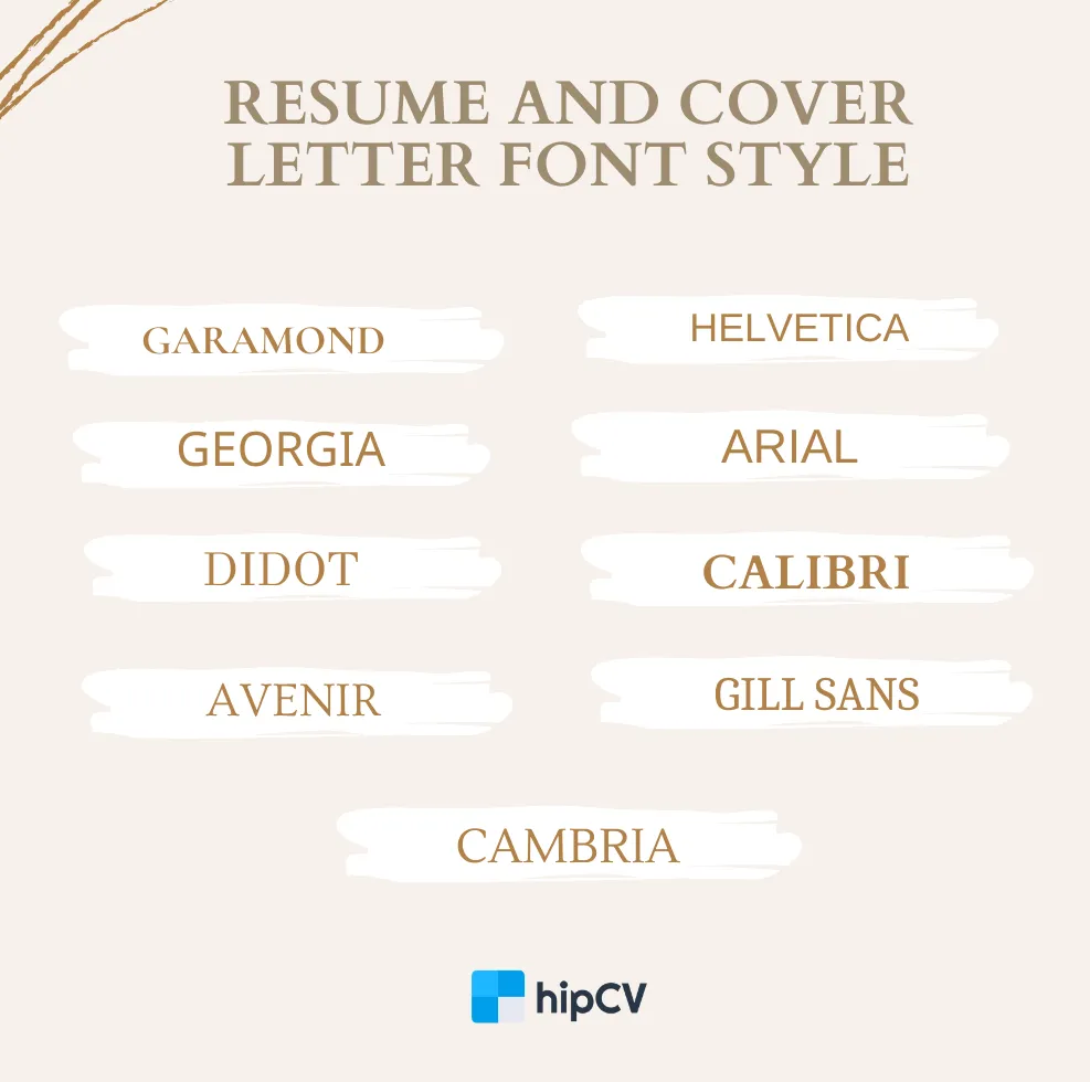
Georgia is another excellent serif font, offering a slightly more modern take than Times New Roman. It’s designed to be highly readable, even at smaller sizes, making it a great choice for cover letters. Georgia has slightly bolder letterforms, which enhance readability and can make your text stand out. This font is particularly effective for those who want to create a professional yet slightly more contemporary look. The readability of Georgia makes it a strong choice for both printed and digital applications.
Best Sans-Serif Fonts for Cover Letters
Sans-serif fonts bring a modern and clean look to your cover letter, offering a contemporary feel. They are well-suited for industries that value innovation and forward-thinking approaches. The simplicity of sans-serif fonts creates a polished, professional appearance, making your cover letter visually appealing and easily digestible. Popular sans-serif choices, such as Arial and Helvetica, are both widely used, well-recognized, and offer good readability, making them suitable options for any job application.
Arial
Arial is a widely used sans-serif font that offers excellent readability and a clean appearance. Its clear and straightforward design makes it a popular choice for professional documents, and its universal availability ensures compatibility across all systems. Arial projects a sense of clarity and professionalism, making it a great option if you prefer a crisp, modern look. This font is excellent for conveying a professional image and ensuring your cover letter is easy to read and understand.
Helvetica

Helvetica is another highly regarded sans-serif font known for its clean, neutral appearance. It’s a versatile choice that fits well in various contexts, conveying a sense of professionalism and modernity. Helvetica’s simple design and well-defined letterforms make it incredibly readable, and it’s a superb option for both print and digital cover letters. This font is an excellent choice when you want to ensure that your cover letter looks professional and polished, enhancing the first impression of your application.
Font Size and Spacing Guidelines
Font size and spacing are crucial factors influencing readability and the overall presentation of your cover letter. The correct size ensures the document is easy to read, and proper spacing prevents your text from appearing cluttered. Applying the best practices ensures your cover letter is visually appealing and conveys professionalism. It is important to strike a balance, ensuring your letter looks neat and is not too dense, so you are giving the hiring manager an enjoyable and smooth reading experience.
Font Size Recommendations
For cover letters, a font size between 10 and 12 points is generally recommended. This size range strikes a perfect balance between readability and fitting your content appropriately on the page. A 10-point font is usually acceptable, especially if space is limited. However, a 12-point font size is often preferable for improved readability, ensuring that your letter is easy for the reader to focus on. Make sure to choose the one that you can easily read and also allows you to include all relevant information without overcrowding your letter. Your priority should always be to ensure that your cover letter is easily read and visually appealing.
Line Spacing Tips
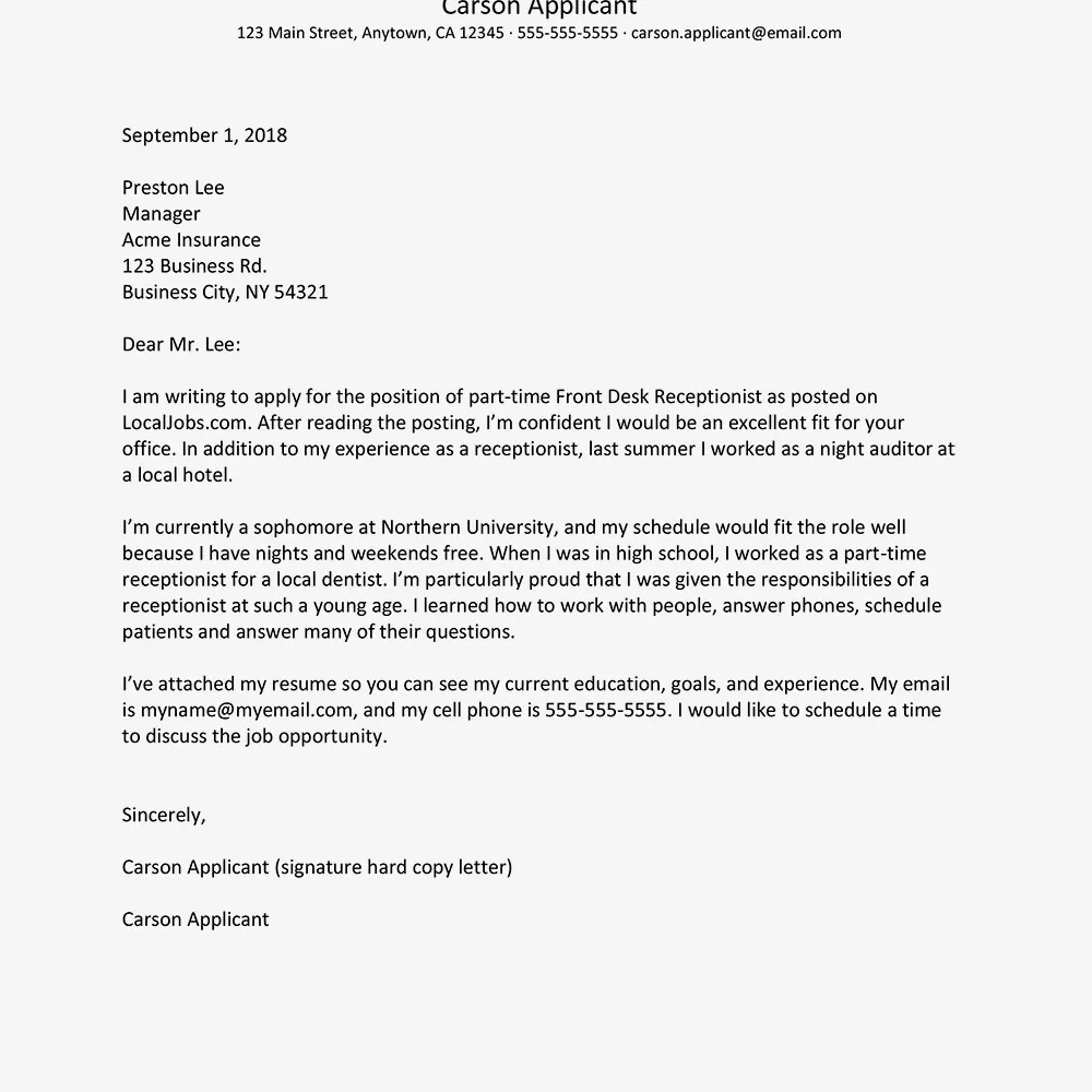
Line spacing should be set to 1.0 or 1.15 to maintain a clean and readable document. This spacing provides enough separation between lines of text to prevent the document from looking dense and cluttered. Avoiding tight spacing is vital, as it can make the document difficult to read. Ensure the hiring manager has an easy and comfortable reading experience. Appropriate line spacing enhances the visual appeal of your cover letter and assists in conveying your professionalism and attention to detail.
Cover Letter Font Mistakes to Avoid
Avoid common font mistakes to ensure your cover letter reflects professionalism and attention to detail. Poor choices and carelessness can make your application less effective. Some common mistakes to avoid include using fonts that are too small, or too many different fonts, so your letter doesn’t look polished and professional. Focusing on these critical points will help you produce a professional and readable cover letter, making a great first impression.
Font Too Small or Too Large
Using a font size that is either too small or too large can significantly detract from the readability of your cover letter. Fonts that are too small are difficult to read, potentially frustrating the hiring manager and leading to your application being overlooked. Conversely, excessively large fonts can make your cover letter look unprofessional and cluttered, squeezing content and taking up too much space on the page. It’s crucial to use a font size that is easy on the eyes and ensures all the essential information fits neatly. The goal is to make the document as user-friendly as possible, allowing the reader to scan and absorb the details efficiently.
Using Too Many Fonts
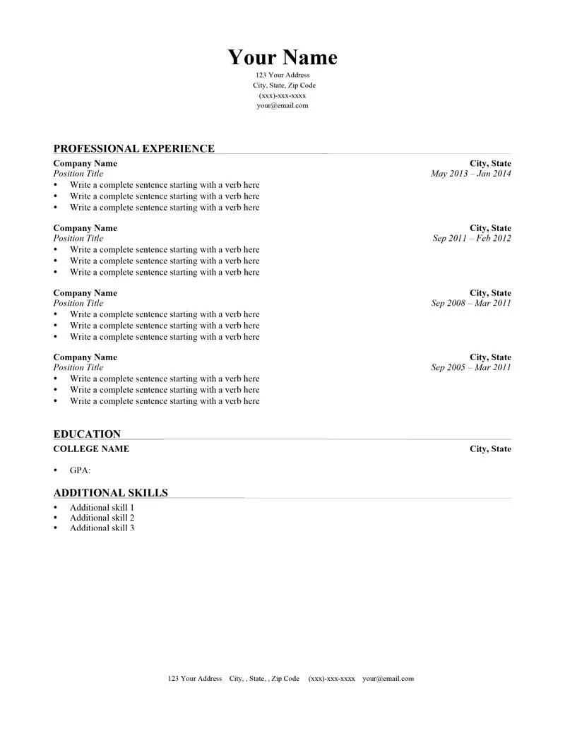
Overusing fonts can create a disorganized and unprofessional appearance. Sticking to one or two complementary fonts keeps your cover letter neat and easy to read. While it may be tempting to use a variety of fonts to make your document visually interesting, this can often backfire, making the document feel cluttered and less professional. If you wish to emphasize a few areas, use variations in font size and bolding instead. This approach ensures your cover letter looks polished and professional and makes your key points stand out without overwhelming the reader.
Testing Your Cover Letter Font
After selecting your font, it is important to test your cover letter before submitting it. Print your cover letter to check how the chosen font looks on paper. This can help you to identify any formatting issues or readability problems. You can also send a digital copy to friends or career counselors for feedback. By testing and seeking input, you can ensure that your cover letter appears professional and is easy to read and understand, maximizing its effectiveness.
Tools to Help You Choose Cover Letter Fonts
Use available tools and resources to select the perfect cover letter font. Many online platforms provide font previews and comparisons, assisting in making informed decisions. Utilizing font pairing guides can help you pair fonts harmoniously, guaranteeing your cover letter looks balanced and professional. These resources will ensure that the font choices complement your content and enhance its overall appeal. You can use these tools to experiment with different fonts and find the best fit for your particular needs and the industry you’re applying to.
